Domain
B2B, SaaS,
OCR & Data Capture
My Role
Lead UX Designer
Duration
~2 Months
Headquartered
Vienna (Austria)
Team Structure
Product Owner
Project Manager
Tech Architect
2 React Developers
UX Designer

~15s faster Time-to-First-Scan, with even greater gains during repeat scans.
26% drop-off reduction via a clear 3-step flow, instant rescan, clearer CTAs, and real-time feedback.

40% fewer clicks through a streamlined flow.
SUS improved from 52 → 74 with clearer, accessible design.
Lead conversion rate increased from 6% to 10% by reducing frictions.

01
Business Context
Anyline is a leading European technology company specializing in OCR and AI-driven text recognition. Their WebSDK demo plays a critical role in helping potential customers evaluate OCR accuracy, speed, and integration feasibility before adopting the product.
However, the existing demo experience was not effectively supporting this evaluation moment.

Happy Stakeholders.png
Business Goals
-
Showcase the WebSDK's scanning power through an intuitive demo.
-
Increase user engagement and demo-to-trial conversion.
-
Reduce friction during first-time and repeat evaluations.
-
Deliver a consistent, brand-aligned(Anyline) experience.
-
Build a fully functional, scalable, future-ready interface within tight timelines.

02
Research & Behavioral Analysis
Understanding Evaluation Friction
Stakeholder Perspective
The Demo as a Trust Gate
Early conversations with Product and Sales revealed that the demo was a critical evaluation touchpoint for potential customers. For most prospects, the demo was:
-
First hands-on interaction with Anyline
-
Proof of technical feasibility
-
Basis for deciding whether to move forward
If users couldn’t reach a successful scan quickly and confidently, they would not trust the product enough to request a trial — regardless of how powerful the OCR was behind the scenes.
This reframed the design challenge from
“make the UX better”
to
“turn evaluation into a low-risk, high-confidence experience.”
Literature Review
To understand product capabilities and constraints, I reviewed:
-
Anyline Cloud API documentation
-
Brand guidelines
-
Scanbooks and sample images
This revealed
-
OCR capability was strong but not clearly communicated through the interface.
-
Trust depended on visual clarity and system responsiveness
-
Accessibility and responsiveness were essential across contexts
Design Implications
-
Limited OCR-specific UX patterns and research online.
-
Accessibility needed to balance brand expression and usability.
-
AI-driven UX promising but not mature for immediate use.
Competitive Research
While direct competitors were not benchmarked, inspiration was drawn from similar functioning platforms like I Love PDF, known for:
-
Minimal steps
-
Clear upload > process > result flow
-
Fast time-to-value
This reinforced the need for a task-first, friction-light experience.
User Interviews & Behavioral Patterns
Here I conducted moderated user interviews where participants were first given brief context about the product and then asked to explore the experience.
Instead of testing for task success alone, the focus was on how users navigated the flow, where they hesitated, and what influenced their confidence while scanning.
During the sessions, users were prompted to:
-
walk through the scanning flow in their own words
-
highlight moments of confusion or friction
-
explain what slowed them down or made them unsure
-
describe what would make the process feel faster or easier
-
interpret results and articulate whether they trusted the output
Where Confidence Broke Down
Across sessions, a few consistent behaviors emerged:
-
Users hesitated early in the flow
Participants often paused at the beginning, unsure about which mode to choose or what would happen next. -
Upload and scan progress felt unclear and Slow
-
Lack of feedback reduced trust during scanning
-
Navigation required unnecessary mental effort
-
Retrying felt costly
Even when OCR worked correctly, the experience felt slow and uncertain due to limited feedback and guidance.
Usability Benchmark (SUS)
A baseline System Usability Scale (SUS) test with 6 users was run on the existing WebSDK demo to quantify how easy it felt to use.
-
SUS score(Avg) : 52
-
Industry benchmark for acceptable usability: ~68
A score of 52 indicates below-average usability and confirms that users were experiencing significant friction while interacting with the demo.
Takeaway
The SUS benchmark validated that the existing demo placed unnecessary mental effort on users during a critical evaluation moment. Improving usability wasn’t just about polish—it was essential to building trust, clarity, and engagement.
Heuristic Evaluation
Visibility of System Status
There’s no clear indication of where users are in the process or how many steps remain, which can lead to confusion and uncertainty.
Match Between System and the Real World
Highlight Anyline's advanced OCR capabilities through a seamless demo that drives trial sign-ups and client confidence.
User Control and Freedom
Users aren’t provided with a simple way to rescan or upload a different document, limiting flexibility and control.
Error Prevention
Users can mistakenly upload unsupported formats due to unclear instructions and missing file-type indicators.
Recognition Rather Than Recall
There are no contextual cues for technical terms, and the uploaded image isn’t shown on the result screen, forcing users to rely on memory.
Flexibility and Efficiency of Use
The system lacks shortcuts or alternate paths for users who want to skip certain steps or quickly rescan documents.
Aesthetic and Minimalist Design
The interface, especially on type selection and result screens, feels cluttered and could benefit from visual simplification.
Help and Documentation
The system lacks in-product guidance such as tooltips, onboarding, or contextual help, making it harder for new users to navigate.
Severity ranged from medium to high across most heuristics.

User journey mapping
A current-state journey map identified where users hesitated, lost confidence, and dropped off during evaluation flow.
It shifted perspective from inside-out product thinking to the outside-in user experience and helped break down silos across the team, creating a shared view of evaluation friction and confidence gaps.

03
From Synthesis to Strategy
Key Behavioral Themes
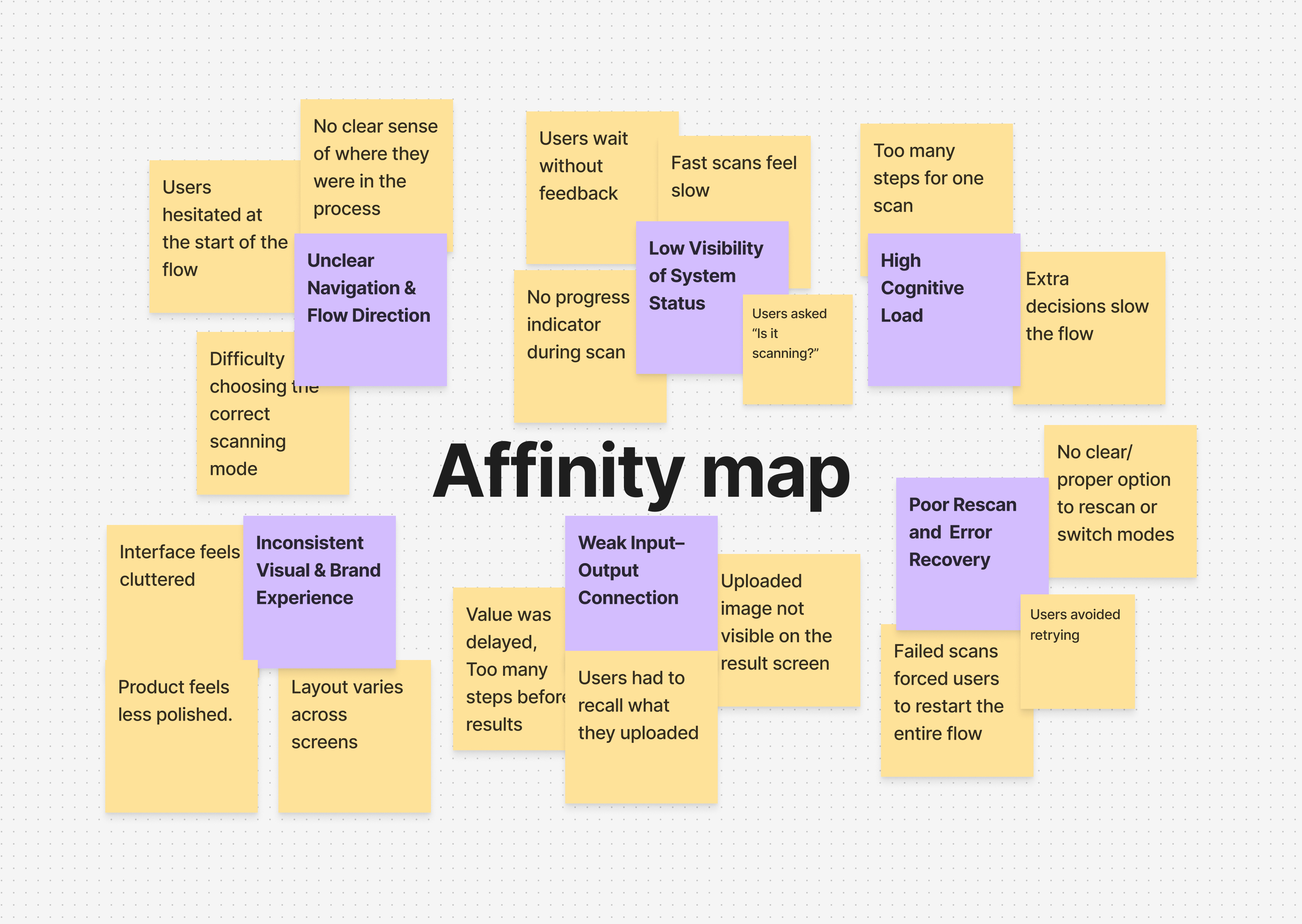
Synthesizing interviews, journey friction, and observations revealed recurring themes:

Key Challenges Identified
Why Users Dropped Off

Users took too long to reach their first meaningful scan result due to early hesitation, unnecessary steps, and lack of visible progress—weakening first impressions and increasing abandonment.
+40%
The experience made retries and experimentation feel costly, discouraging users from testing variations and diff inputs/outputs during evaluation.
Unclear system feedback, weak input–output connection, and inconsistent presentation caused users to question scan accuracy and reliability.
Completing a basic scan required more thinking and interaction than users expected, creating friction disproportionate to the task’s simplicity.
Visual clutter, inconsistent behavior across devices, and lack of refined feedback reduced perceived product maturity during a critical business evaluation moment.
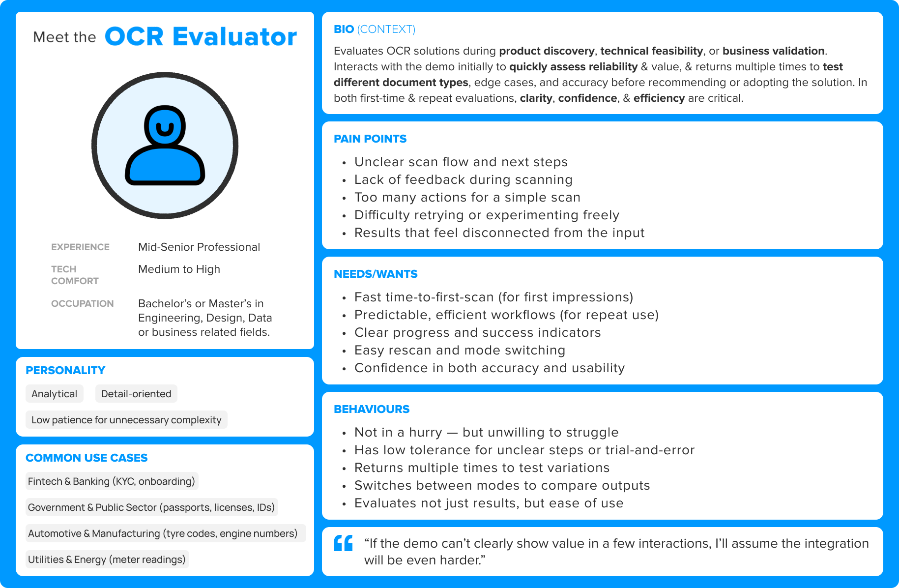
Persona (Research Synthesis)
Insights were distilled into one primary persona:
The OCR Evaluator — a business/technical stakeholder assessing OCR solutions for feasibility and trust.
Insights to Strategy
Strategy : Turn the WebSDK demo into a confidence-building evaluation experience.
User research showed that early demo moments were dominated by hesitation, unclear feedback, and high cognitive effort.
So the experience was designed around 3 strategic principles :
-
Fast success builds trust
-
Uncertainty kills engagement
-
Exploration should feel safe

04
Design Execution
From Hesitation to Confident Action
With strategy defined, the focus shifted to translating confidence principles into concrete interaction decisions. The work centered on simplifying the flow, clarifying system feedback, and enabling safe exploration.
Simplifying the Scan Journey
Exploring Layout Directions
The interface still needed to support quick mode switching and rescanning.
Two layout directions were explored:
-
Persistent side by side controls
-
Sequential single panel interaction
Testing showed the side by side layout reduced interaction steps, improved control, and kept marketing content visible above the fold.
The side by side layout was selected as the foundation.
Establishing Visual Direction
Before moving into interface design, a lightweight moodboard helped define the visual tone for the experience — emphasizing clarity, structured hierarchy, and subtle motion aligned with Anyline’s technical brand.

Translating Strategy into Interaction
With the structure and visual direction established, the interface was refined around four design principles aimed at making the product easy to try, easy to understand, and safe to explore during evaluation.


1.Accelerate Time to First Value
The interface was designed so users could reach their first successful scan within seconds, reducing friction during evaluation.
-
Sample images enabled instant testing
-
Upload triggers automatic scanning
-
Removed explicit “start scan” actions
-
Minimal setup before first result


2.Reduce Uncertainty Through Clear System Feedback
To build user confidence, the system continuously communicates what is happening and when results are ready.
-
Visible scan progress and system states
-
Clear success, loading, and error feedback
-
Result confidence and processing time displayed


3.Encourage Safe Exploration
Evaluation often requires testing multiple inputs and modes. The interface supports experimentation without forcing users to restart the workflow.
-
Instant rescan capability
-
Mode switching without resetting the flow
-
Persistent sample images for quick retries


4.Reinforce Trust Through Clarity and Consistency
A restrained visual system ensures the interface feels reliable, readable, and technically credible.
-
Consistent layout across screens
-
Clear hierarchy for results and actions
-
Accessible contrast and typography
The System in Action

These decisions collectively shaped the final experience—one that feels fast, clear, forgiving, and trustworthy during product evaluation.
Web - Prototype

Mobile - Prototype

System Usability Scale (SUS) Testing
Post-Redesign Outcome
-
SUS score improved from 52 → 74 (+22 points)
-
This shift moved the experience from “Poor” to “Excellent” usability
-
It aligned user perception with Anyline’s brand promise of speed, accuracy, and simplicity
What This Means?
SUS results validated the redesign’s effectiveness:
Users not only completed tasks faster but felt the system was clearer, easier, and more intuitive, a critical factor in demo-driven product adoption.
Handoff & Collaboration
Worked closely with developers to ensure smooth implementation.
Regular cross-functional reviews helped align visual fidelity, motion behavior, and technical feasibility.
The final build accurately reflected the design vision while maintaining performance and accessibility standards.

05
Outcomes & Learnings
Outcomes
The redesigned WebSDK demo delivered measurable improvements across usability, efficiency, and conversion:
-
40% fewer clicks per scan, driven by a simplified 3-step flow.
-
~15s faster Time-to-First-Scan, with even greater gains during repeat scans.
-
26% drop-off reduction.
-
SUS improved from 52 → 74.
-
Lead conversion increased from 6% → 10%.
-
WCAG 2.1 AA compliant, ensuring accessibility across devices and users
-
Delivered on time with 100% client satisfaction
Key Learnings
-
Clarity matters as much as speed
Simplifying the flow reduced effort, while clear feedback and recovery reduced hesitation -
Accessibility isn’t optional
Designing for WCAG compliance improved clarity and usability for all users, not just edge cases. -
Prototypes accelerate buy-in
Letting stakeholders experience the flow firsthand reduced ambiguity and sped up approvals. -
Design efficiency = business efficiency
Simplifying workflows reduced user effort while directly improving engagement and conversion.
“The redesigned demo has completely elevated how we present our technology. It’s faster, smarter, and feels smooth."
— Lucie M., Project Manager, Anyline
That’s a Wrap
In the end, great UX made great tech shine — and Anyline’s demo now scans faster, feels smarter, and sells itself.


